Top 15 Best Trucking Industry Infographics

Top 15 Best Trucking Industry Infographics

Top 15 Best Trucking Industry Infographics

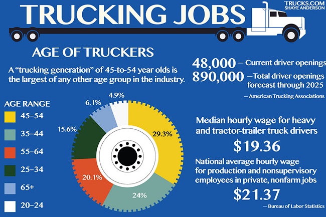
Trucking industry infographics can be such a great tool for expressing ideas and sharing information. Yet there are still people out there who really don’t know what infographics are. Nor do they do how they can assist your company in sharing information, vision, or reaching new customers.

LEARN 12 SECRET STEPS HOW TO MAKE $950 MORE PER TRUCK / MONTH

Hey! I'm George J.Magoci and I will send you a FREE eBook where you can learn 12 secret steps how to make $950 more truck/month.

Free ebook

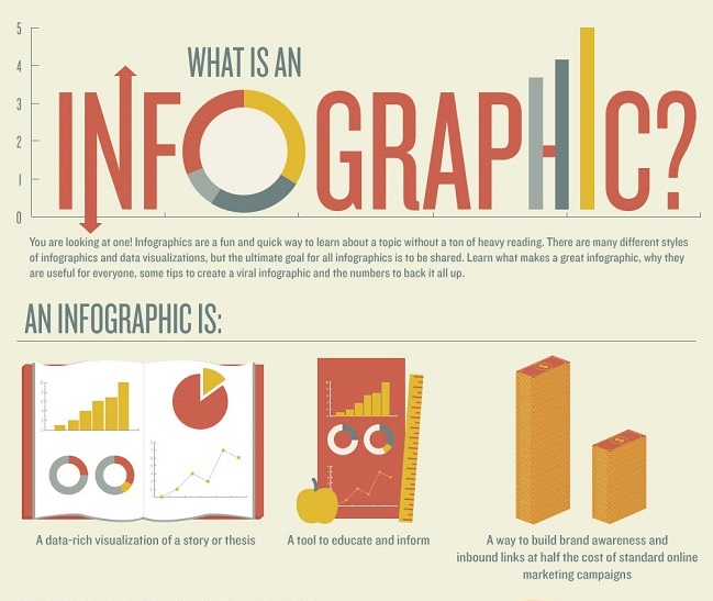
So let’s start with the basics, what are infographics? They are an informative and entertaining way to express a complex or lengthy concept. In doing so the infographics uses a combination of words and images to help get their point across. So instead of a lengthy article (like this one), the reader gets to learn through visual images, further enhancing and developing the idea.

You have heard the old saying “a picture is worth a thousand words”. Well then the average infographics is worth 10,000 or more! They usually use a flowing format that helps guide the reader from one key point to the next. A good infographics is like a ‘PowerPoint’ presentation without having to hit, next, next, next. Much like the hieroglyphics of ancient Egypt moved the reader from one image to the next, while expressing an idea, do modern infographics.

Now there are some discussions regarding how the infographics should be used. They also debate on the different formats used to make them. But everyone agrees they are a valuable tool regardless what style you use.

Just try to keep the images appropriate to the tone of the massage you’re wishing to get across. As an example, don’t use silly cartoons while trying express a serious topic. With that said, here are the more common infographics formats:

  • Cause and Effect infographics demonstrate the relationships from on stage of the concept to the next. (Driving too fast may result in you getting a speeding ticket, which will affect your safety rating, which may cause you to lose customers).
  • Chronological infographics share the stages of an event as it passes through time. (May third you got stopped for speeding, June 15thyou failed to show up at traffic court, July 21st customer XYZ went to the Federal Motor Carrier Safety Administration (FMCSA) and used their Safety and Fitness Electronic Records System (SAFER) checked out a company snapshot of your organization, noticed several unresolved traffic violations resulting in a negative rating. July 22nd XYZ cancelled their transporting contract with you.)
  • Quantitative Infographics offer statistical data in an easy to read and understand format. These usually include charts and graphs, flow charts are very common. (Graph showing the number and type of traffic violations, per trucking company, over the course of a 12 month period, and detailing the types of violations (speeding, exceeding weight, lights not working, etc.).
  • Directional Infographics are like road maps, they guide you from one point to the next. (Trucking industry infographics showing how strong well respected companies can slowly sink. This can happen by reduced safety standards, increased traffic related violations, the loss of clients, and either restructuring, selling, or closing.)
  • Product Infographics are very common. They either are targeted to potential clients or staff. These are often like what you see with the nutritional pyramids in school, conveying an idea and why it is good. (Maintaining appropriate speeds equals safe driving and reduces tickets, accidents, and damages (and an increased safety rating), which results in gaining more clients who value a company’s efforts to observe proper safety).

Top 15 Best Trucking Industry Infographics
Source: www.Trucks.com


There are a few other styles of infographics which are used. As you see here I listed 5, some say there are as many as 10 different types. A couple of the additional styles include “How to (the steps to involved)”, “Comparison (this compared to that)”, and “Location (Chicago is this and this)” just to name a few. These are fairly self-explanatory but remember you can even combine styles as long as you don’t lose your message or confuse your target audience.

For example you might be creating a “How to” infographics. The topic might be building bird houses. So, you could give the steps involved, while at the same time comparing American styles to European. Or go over the use of glue versus nails versus screws.

Regardless which style you go with, there are a few things to keep in mind. All Infographics are made up of three key parts, the visual (color, images, etc.), content (information, stats, points), and knowledge (the actual facts). So keep that in mind when designing, or commissioning, trucking industry infographics.

A few other things to remember is that your infographics need to express the idea or message as clearly as possible. Being creative and abstract is part of the artistic process, but if you overdo it you’ll lose both the message and your audience. So try to stick with your message while at the same time capturing the reader’s attention.

So now what are some tips to get your out and read? Well, to be honest like everything in life there is no one correct answer. It really depends on the message and who you are trying to reach. There are numerous infographics out there on TV and the web. Go to Facebook, LinkedIn, Twitter, or any other social media site and you’ll have plenty examples. Some are examples of how to create good infographics, while others are examples of how not to create them.

So here are few simple tips to follow:

  • Keep it simple. They should be concise, clear, and easy to comprehend.
  • Showing relationships can really help people understand your concept. Some like comparing good driving records to bad or changing clothing trends.
  • Stay on topic and stay focused. Even though the bigger picture of your topic might be full of other good information, stick with one key topic. Don’t start your topic with tips on how to maintain a good safety rating, and then go into getting a good load, and then go into proper maintenance. Stay on point.
  • Understand the importance of colors. Colors can actually guide the reader to the mood you’re wishing to get. Bright colors are more for positive feelings. While darker colors convey a more negative feeling. Make sure you background doesn’t swallow up the text either.
  • You must ensure the proper layout. These aren’t meant to be viewed as you would a newspaper or even a graphic novel. Make sure the flow leads the reader to each point in the order you want. But feel free to mix it up, use images, charts, drawings, and icons. Don’t overdo the fonts; stick with two or three max. One other thing, if it is yours always includes your company logo.
  • Keep it appealing, that doesn’t mean the topic itself must be happy and cheerful. What that means is when the reader is looking at it feels comfortable. You shouldn’t include external links that the reader must click. It is ok to all the reader to click thumbnails to increase them (as long as the image is there). Don’t clutter it up with too many images like some grade school collage.
  • Be factual and be able to have the information verified. It is ok to give opinions (if stated as such) and it’s ok to round figures (just note approximate). But if you use facts a figures give a source so that people can look it up and learn more if they wish. Always cite your sources for your images, charts, quotes and anything else not written by you (or your staff).

Well hopefully this has given you a better understanding of infographics and how they are used. When creating them you learn there are numerous concepts and ideas so go with what feels best to you. The only point I will stress is that they are meant to be informative and easily understood.

Top 15 Best Trucking Industry Infographics
Source: www.protectmycdl.com

Comments

comments

< Page 1 / 5 >